Ben Pinkney - Graphic Design
Friday, 28 March 2014
Friday, 31 January 2014
Typography Posters (Avant Garde and Alega)
These are the posters in which i designed to advertise/ sell the typeface, and these show the changes in what i made after the CRIT.
Thursday, 19 December 2013
Digital Imagery for CD project
This is a poster in which i used as my final piece, as a promotional aspect for the CD.
This was my initial idea for my CD, as you can see i started with the idea of using the nursery rhyme idea and created animated illustrations.
This is my final front cover and back cover.
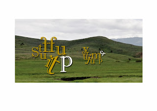
These images are the imagery from the booklet i designed for my CD and they are purely typographic to illustrate what animals they are through the sounds in which they make.
Tuesday, 10 December 2013
Cd Cover reference....
This is Album covers from the 60's which is the era of the song in which Bonzo Dog Doo-Dah Band released it, 1967, this gives me reference when it comes to the designing process.
The designs that where about in the 60's really give a reference of the vibrant and colourful nature of 1960, and artist in which were in their prime like Andy Warhol, Roy Liechtenstein and Milton Glaser.
The designs that where about in the 60's really give a reference of the vibrant and colourful nature of 1960, and artist in which were in their prime like Andy Warhol, Roy Liechtenstein and Milton Glaser.
Friday, 6 December 2013
Tuesday, 22 October 2013
Mood Board for Setting of the Game
These are Mood Boards depicting on the aspects of which the intro to our Game will take place, this research was required to give a more realistic view to our game and i created two separate mood boards because there was two aspects which i want to combine. First mood board shows the setting of a Laboratory and the images are quite dark because i depicted lethal injection as this is the type of experiments which we have discussed are possible to take place within the concentration camp, also getting floor plans will help within thinking of how the floor plan to our location will look. The second mood board shows imagery from German concentration camps and as you can see most of the imagery is black and white which works well because that is the colour scheme which we plan to follow with.
Subscribe to:
Comments (Atom)


